Onboarding — removing friction without removing rigour
Opening a regulated investment
account is legally complex.
It doesn't have to feel it.
New users had to open a German depot account as part of signup — KYC, identity verification, tax information, regulatory disclosures. This wasn't optional and it couldn't be hidden. The job was to make it feel like the minimum necessary friction, and nothing more.
The approach was methodical: anything that could be deferred was deferred. Anything legally skippable was removed. Every anxiety-inducing step was front-loaded with context — users knew what they'd need before they needed it. Progress was always visible. Nothing appeared without explanation.
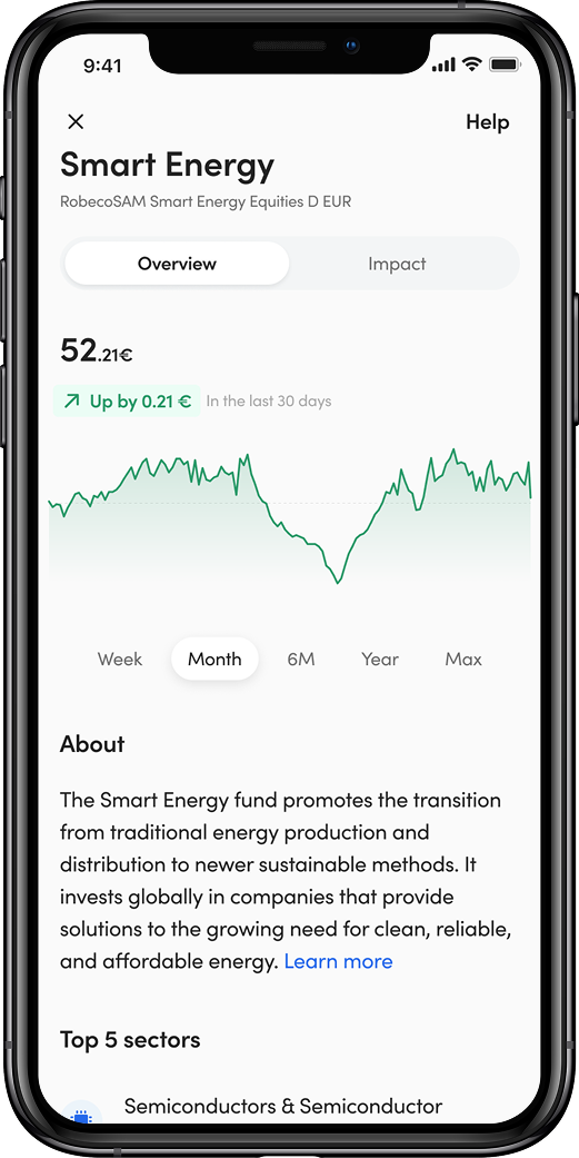
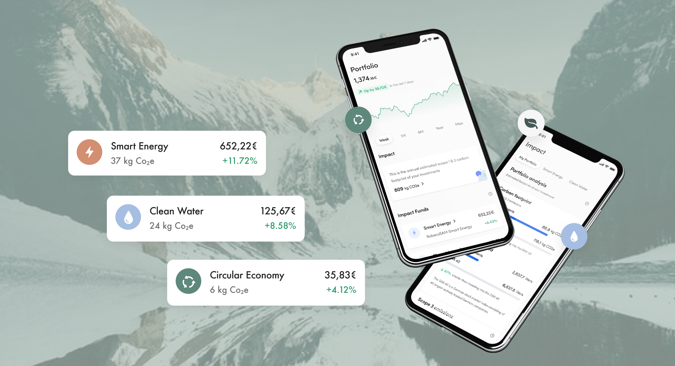
Once registered, users moved straight into fund selection — choosing the themes that matched their values before committing any money. Smart Energy, Clean Water, Circular Economy, Forestry & Timber. The investment followed the conviction.
Onboarding completion is the single most important metric for a product like this. Every moment of unexpected friction is a drop-off point. Getting this right wasn't a nice-to-have — it was the difference between a business that worked and one that didn't.
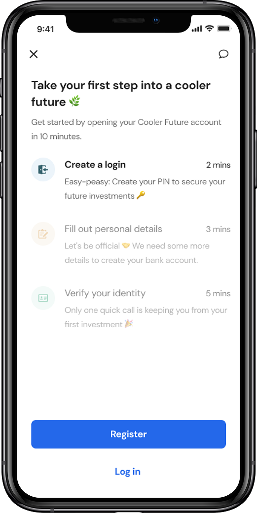
Register in 10 mins
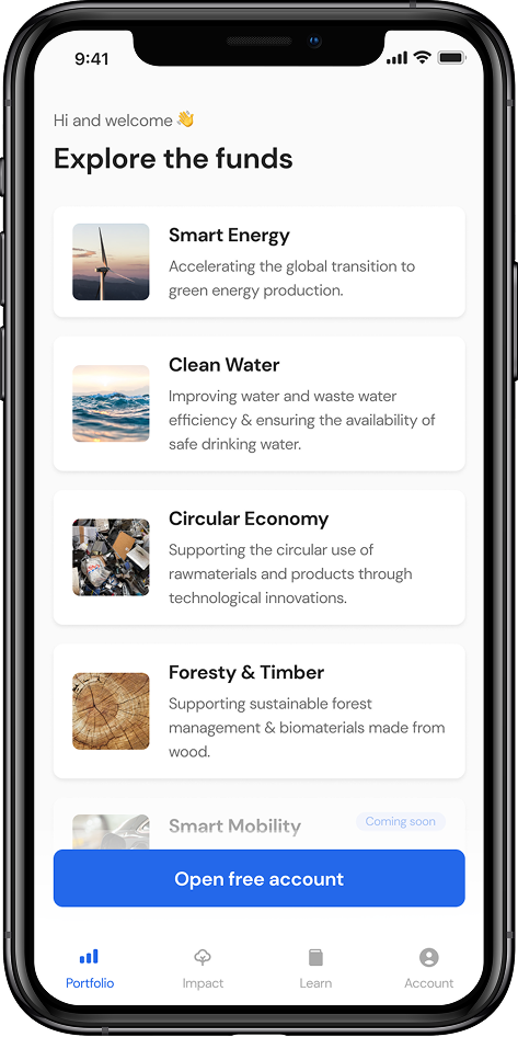
Choose your themes
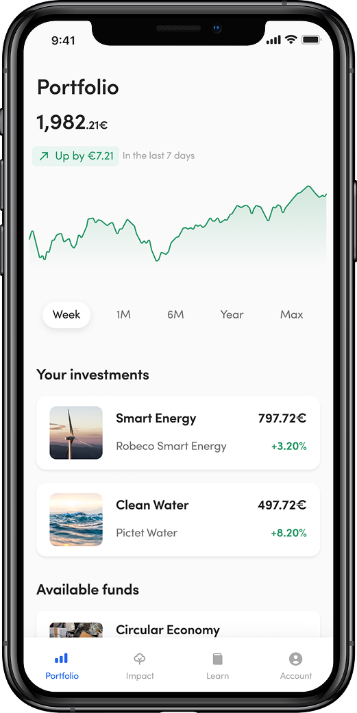
Your portfolio